The aim of the project is to research,examine and document diverse ways of representing the numbers using art. For any aspiring data scientist,improving data visualization skills are important in communicating results to other people effectively.
It is obvious that vision is most powerful communicating channel. We can detect information more faster from a picture than from any other medium. Especially, while communicating data through numbers it is easy to get confused and misunderstood. For example, summary statistics can hide important information and it is hard to detect pattern by directly looking at numbers.Whereas numbers in the form of art can assist to easily infer the information.
As the data becomes more complex, the easier the art form is, the easier it becomes to read and understand. With this as a fundamental, the following arts have been selected
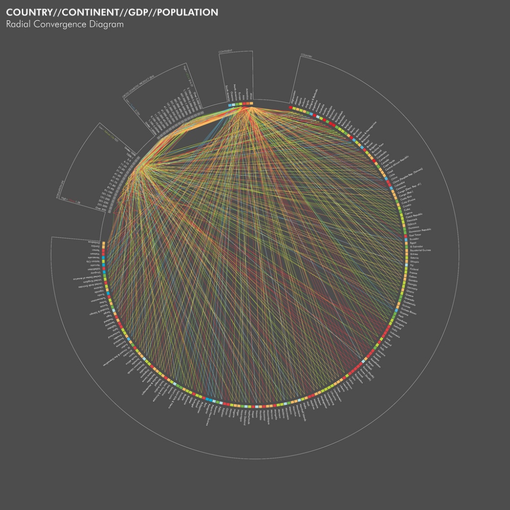
Radial convergence diagram:
http://www.visualcomplexity.com/vc/project_details.cfm?id=743&index=743&domain=
The author of this project michael levi has used radial convergence diagram to represent connections between countries, continents, GDP and population using data from Wikipedia. It is a challenging task to represent four dimensions in a single picture but using radial convergence diagram it became easy through mapping between different entities to communicate the information.
Community Structures:
Social networks contains lot of information which is complex and hard to understand.Lara adamic social networks researcher has done community detection by generating following picture using GUESS network analysis tool.
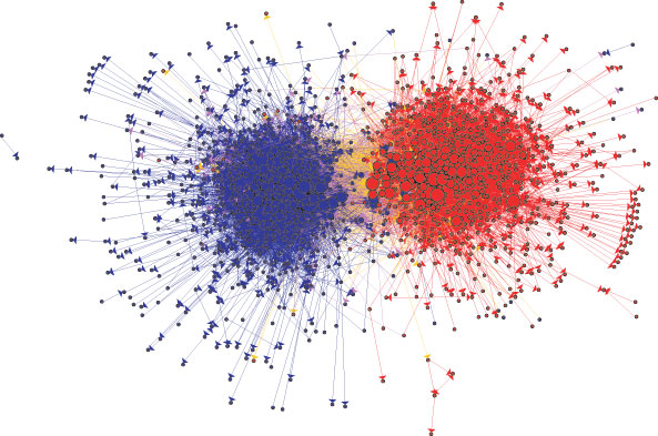
The above picture tells us about Community structure of fifteen hundred political blogs, the colors reflect political orientation, red (right) for conservative and blue (left) for liberal. Orange (center right) links are citations of conservatives by liberals, and purple (center left) links are citations of liberals by conservatives. The size of each blog reflects the number of other blogs that link to it which tells us about how popular is the blog.
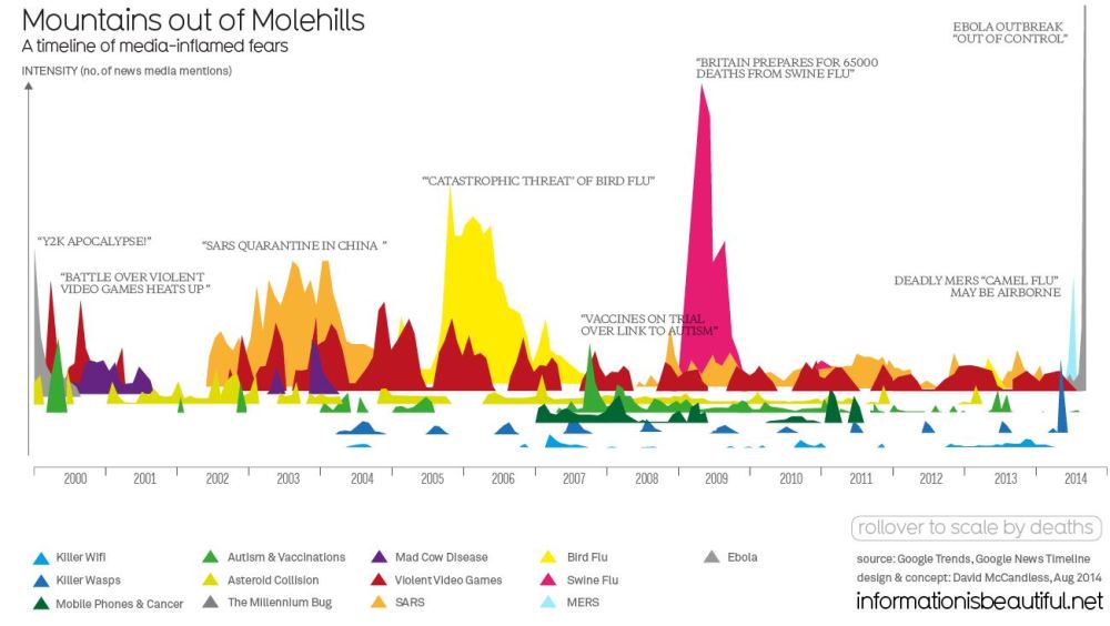
Information is beautiful:
http://www.informationisbeautiful.net/visualizations/mountains-out-of-molehills/
David McCandless from information is beautiful used interactive diagram to timeline of inflamed disease fears below:
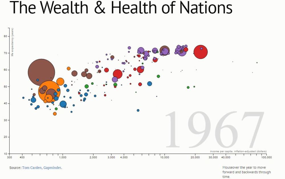
D3.JS and time as a dimension
Recent visualization tools has helped to express art in much more clear way.This is interactive visualization using d3 js helps to illustrate the time also as a factor in the picture.
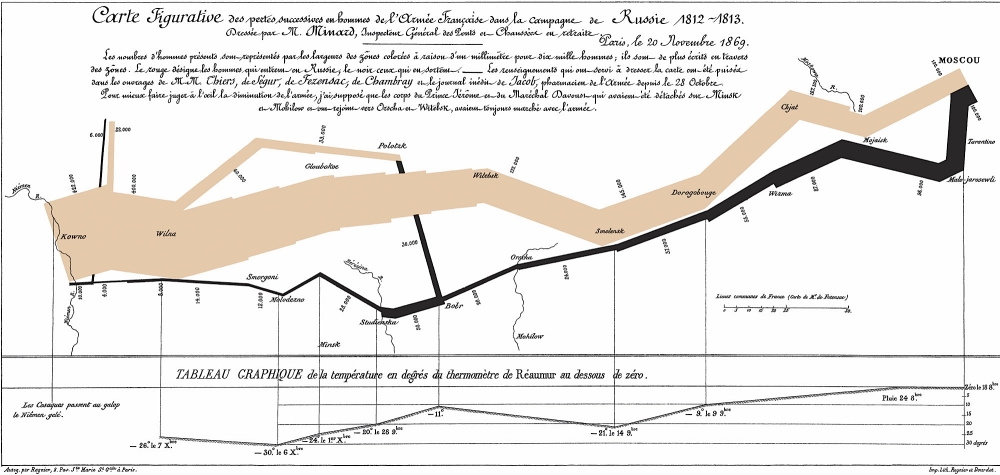
Map of Napoleon invasion on Russia by Charles Joseph Minard
DataViz History: Charles Minard’s Flow Map of Napoleon’s Russian Campaign of 1812
It is hard to describe six dimensions in a single art. But Charles Joseph Minard a french civil engineer’s chart shows six types of information: geography, time, temperature, the course and direction of the army’s movement, and the number of troops remaining. The widths of the gold (outward) and black (returning) paths represent the size of the force, one millimetre to 10,000 men. Geographical features and major battles are marked and named, and plummeting temperatures on the return journey are shown along the bottom.
The chart tells the dreadful story with painful clarity: in 1812, the Grand Army set out from Poland with a force of 422,000; only 100,000 reached Moscow; and only 10,000 returned. The detail and understatement with which such horrifying loss is represented combine to bring a lump to the throat.
Seismic Data Art Shake Up by Herman Kolgen
http://thecreatorsproject.vice.com/blog/virtual-human-towers-and-seismic-data-art-shake-up-barcelona
Herman Kolgen, who presents Seismik_Index, an audiovisual experience that uses seismic readings taken from across the earth as input data for sounds and visuals.
It’s a variation on a previous work entitled, Seismik, which, in Kolgen’s words, “is inspired by the impact of natural territories on human life.” Explains Kolgen, “It explores terrestrial frequencies and seismic readings—geodetic phenomenons, slidings, fossil earthquakes, and geological modelings—from different locations around the globe and converts them into dynamic audio and visual motifs.”
Chicago School map choice:
A group of nine science students at Northwestern and 11 art and design students at the School of the Art Institute collaborated to find new ways of turning all the numbers into pictures and objects, with the goal of making them comprehensible to the average viewer.
so they came up with project to map school choice in Chicago
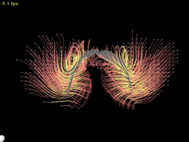
Bat Flight Dynamics
http://vis.cs.brown.edu/results/images/Laidlaw-2004-VMS.007.html
A new 3D virtual reality visualization tool for studying fluid flow around a flying bat.This tool provides easy identification of the vortices around the wing as well as wake structures, both of which is help in understanding bat flight aerodynamics. Yellow streamlines indicate low λ2 regions, red streamlines indicate higher λ2 regions, and the white dots are the streamline seed points.
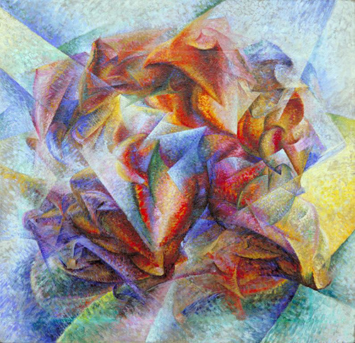
Umberto Boccioni, Dynamism of a Soccer Player, 1913
https://artstor.wordpress.com/2014/06/27/in-the-news-soccer-fever/
Umberto Boccioni, Dynamism of a Soccer Player, 1913. Image and original data provided by the The Museum of Modern Art, moma.org